Packaging Prepress Tips for Flawless Print-Ready Files
- December 30, 2025
- Prepress Services
- Kevin Bharmal
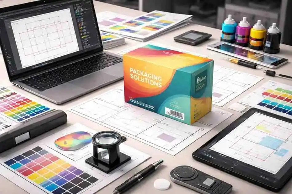
Packaging prepress is like the secret backstage crew of the print world: it takes your digital package design and turns it into a reality on the shelf. Think of it as the pit crew for your packaging catching mistakes before the big race, fine tuning colors, and making sure those box folds and finishes come out just right.
In preparing for packaging prepress, we don’t just create a flat image; we develop a dieline blueprint, adjust artwork for specific materials, manage tricky color conversions, and even plan for special finishes like foil or UV coating.
All of this happens before the printing press even starts. The goal is a flawless, brand-true package whether it’s a cereal box or a luxury perfume carton.
Packaging is a different beast than, say, a magazine cover. Here the material and structure often are the product, not just the ink on top.
That means packaging prepress steps are extra important. As one industry expert notes, “unlike commercial print where print is the final product, in packaging print the majority of the value is in the substrate and its conversion”.
In short, we spend a lot of time making sure the box itself, its shape, folds and even how it feels is perfect, because most of the package’s impact comes from how it’s built, not just how it’s colored.
Table of Contents
Toggle1. Packaging Prepress: Key Considerations for Perfect Prints
Preparing a design for packaging involves several critical steps. Verifying design files ensures correct format and resolution. The dieline and structural setup define the packaging shape, while file preparation and proofing check for errors before production.
Color management ensures consistency across printing methods, and substrate/material choices impact the final print quality. Special finishes enhance the packaging’s appeal, and understanding the differences between packaging prepress and standard print processes ensures all requirements are met for optimal results.
a. Gather and Verify Design Files
Your prepress team needs the right files to start. This means collecting high resolution art, vector dielines, and all linked files and fonts. If you send us a design in Adobe Illustrator or InDesign, double check that every font is outlined or included and every image is highres .
Prepress pros will run a “preflight” on the files looking for missing fonts, low-res images, or incorrect dimensions before any plates are made.
prepress starts with clear files and templates. Providing the correct dieline and fully outlined graphics means your design slips right onto the box structure . Proper files ensure the printed box looks as stunning in person as it does on your screen.
b. Dieline and Structural Setup
A dieline is the flat cut outline of your package essentially a blueprint for cuts, folds, and glues. It includes every score line , cut line, tab, and flap so the die cutter knows exactly where to trim and crease.
Think of it as the skeleton under your package’s “skin.” You place the graphics over this dieline template, aligning logos and artwork to the right panels. In packaging prepress, the dieline must be on a separate layer or file so printers can see exactly where to cut.
Structure vs. graphics: In packaging, the structure is as crucial as the graphics. Structural designers choose things like corrugated flute or folding carton stock to protect the product, while graphic designers pick colors and logos.
These two must work together: for example, a 2mm flute corrugated box might need a slightly different dieline and bleeds than a thin paperboard box. Packaging prepress bridges these: we ensure your artwork aligns to the correct panels and that structural quirks are accounted for. As PakFactory explains, dielines cover size, folds, and all cut/crease locations; they’re the blueprint for building the final package.
Checklist: When setting up the dieline, make sure it includes:
- Cut lines – where the box is cut out.
- Crease/fold lines – where the box folds.
- Bleed area – ensures no white edges after cutting.
- Safe zone– keep important text/logo within this so it’s not cut off.
- Glue tabs– some need cross-hatching for clarity.
- Any windows or special cutouts – if the package shows the product, outline them clearly.
It can help to color code or label each line in your file so nothing is missed. The prepress team at Alpha Prepress and others will verify this and may provide a template many packagers supply dieline templates to ensure perfect fit.
Using the printer’s own dieline template is golden advice for brands: it means your artwork “snaps” exactly onto the correct panel dimensions.
c. File Preparation and Proofing
Once the dieline is loaded, prepress continues with artwork checking and color conversion. At this stage, teams will convert your file to the right color mode and ensure any spot colors (Pantone) are set up correctly.
For packaging, many brands use Pantone inks to guarantee exact brand colors or vibrant hues that CMYK can’t match. Pantone provides a universal “color language”pre-mixed inks that give consistent color on any substrate. Prepress will ensure Pantone swatches are correct .
If your design only uses CMYK but you want special brand tints, prepress can convert to Pantone or add extra color plates. Keep in mind: substrate matters. Printing on brown Kraft vs. glossy white boards makes colors look different; a CMYK file on kraft will generally print darker and warmer than on bright white.
Overprinting is simpler but makes the top color slightly transparent. Trapping involves slightly expanding one color into the other to prevent any white gap. The Trebnick guide explains: “The overlap of color is called trapping…preventing any white gaps in the print”. Your RIP might handle this automatically, but it’s wise to review or set traps for critical graphics, especially with spot colors.
That’s why Pantone has coated vs. uncoated swatch guides – they assume different base paper. A rule of thumb from EcoEnclose: always preview your colors on the actual material if possible, or do a test print.
Good prepress teams will flag if a chosen Pantone doesn’t exist for coated stock, or if a spot color needs tweaking.
With digital proofs prepared, designers and brand teams get to review everything: text legibility, barcode scans, logo positioning, plus the critical dieline overlay. This is the last chance to catch errors.
Miller Graphics recommends checking packaging layers, barcodes, and overall coherence in the PDF. After that, a contract proof is usually produced. Seeing your design printed on paper or on a simulated stock lets you feel textures and confirm colors. Only once both digital and physical proofs are signed off does the job go to press.
d. Color Management for Packaging
Color is the star of many packaging designs, so prepress takes it very seriously. Unlike just posting an image online, printing relies on ink chemistry and the material under it.
Packaging teams will calibrate monitors and press conditions so the printed result matches the intended colors as closely as possible. They convert RGB or spot color files to CMYK profiles specific to the print process .
Brand colors often use Pantone: for example, a brand’s exact red might be PMS 186 or 032. Designers typically pick Pantone swatches in their files, and prepress makes sure those translate correctly into plates. As EcoEnclose notes, Pantone inks deliver “brighter, more pigmented colors with crisp lines”.
However, too many spot colors add cost. The savvy brand will limit spot colors and let rich black or CMYK handle gradients or photos. Prepress can advise if a heavy effect absolutely needs a separate spot.
Whether CMYK or spot, prepress will prove color accuracy. Tools like spectrophotometers and color bars on the press let operators adjust ink density. This level of quality means the final package not only looks good, but also fits brand expectations because 100% color accuracy can make or break how customers perceive a product’s quality.
Visualizing color: Using Pantone swatches or CMYK test prints helps prepress teams ensure brand colors will print just right on the chosen box material. The right color management bridges what you see on-screen and what hits the shelf.
e. Substrate and Material Considerations
Ask any prepress expert: the material is half the story. Corrugated cardboard, coated folding cartons, plastic labels, metal, glass each substrate handles ink differently.
Prepress compensates for this. For example, printing on kraft paperboard will dull and darken colors more than white paper, so artwork often needs an expanded gamut or a Pantone tweak. On metal or plastic, ink adhesion and gloss levels matter prepress will use appropriate color profiles to ensure vibrancy.
Some surfaces require primers or special inks. For instance, plastic shrink sleeves often need opaque white underprints under CMYK so colors pop. If your label design sits on a clear bottle, prepress must specify a white layer first.
Likewise, reflective or foil-coated stocks might need extra consideration. These details all get hammered out in prepress: adjusting layers, adding knockouts, and communicating substrate choices.
The key takeaway: tell your prepress partner exactly what material you’re printing on so the file can be tailored to that material.
f. Special Finishes and Effects
Want your package to feel as special as it looks? Prepress will handle that too, by planning special finishes. Common effects include Spot UV varnish , embossing/debossing, foil stamping , and laminations . Each of these is applied in a specific press run, and prepress must set up files accordingly.
For example, Spot UV is usually created by making a separate copy of the art and filling only the areas needing gloss with a named spot color like “SpotUV”.
Precision Graphics advises submitting each finish on its own layer or file. In practice, you’d often see a layer called “UV_lacquer” or a Pantone swatch named “FOIL_STAMP” in the Illustrator file.
The printer then makes a second plate or cylinder just for that finish. We’ll also ensure foil and emboss designs are vector art with clean lines, since fine details below ~0.5pt may not transfer well.
Here’s a quick overview table:
| Finish/Effect | What It Does | Prepress Setup |
|---|---|---|
| Spot UV/Varnish | Adds shiny highlights to parts of the design | Create a separate spot-color layer |
| Emboss/Deboss | Raises or recesses design elements | Outline the embossed areas on a separate layer and indicate “Emboss” in file name; keep artwork vector |
| Foil Stamping | Applies metallic foil accents | Use a spot color named for foil; often it needs a heat/pressure plate. Separate layer for foil art |
| Lamination (Matte/Gloss) | Protective film over entire surface | Note it in specifications; art itself usually unchanged, but adjust design if lamination affects appearance |
| Die-Cutting Windows | Cutouts to show the product inside | Include in dieline; artwork on window edges should account for backing color or transparency |
Special effects turn ordinary boxes into experiences, but they require clear prepress communication. Always list them in your “read me” or instructions so prepress doesn’t miss them.
2. Differences: Packaging Prepress vs. Standard Print
Packaging prepress isn’t just “glue, and it’s done” it’s a specialized version of prepress. In commercial printing , you worry about paper stock and color, but that’s mostly it. In packaging, the game changes: structure, durability, and final construction are just as crucial.
For one, packaging often runs on flexographic, rotogravure, or digital narrow web presses, whereas standard print might use offset or digital toner.
Packaging jobs usually involve long runs where color stability and registration over large panels is key. Plus, as Packaging Impressions points out, most of the cost in a package is the material and the die cutting, not the ink.
That means prepress must nail the substrate specifications and give precision guides for converting the flat sheet into a box.
Another big difference: proofing and safety. Packaging often contains safety warnings, ingredients, and barcodes some even have tactile or Braille elements. Prepress will check text tiny sizes and barcode clarity.
Also, because packaging is 3D, it’s subject to folding tolerances. Commercial print typically ends at trim, but packaging must fold and glue precisely. Hence we sometimes include “structural creep” adjustments . These little nuances show up only in prepress.
So yes, your regular print vendor might sell you an “offset job,” but packaging jobs go through a different workflow. The printers investing in packaging have the special cutters and know-how.
Small commercial shops might dabble in carton or label printing, but as noted, they’ll usually stick to simple folding cartons or roll-fed labels, not complex corrugated or shrink sleeves. In short, if your project is a package, you really want a packaging savvy prepress team on it.
3. How packaging prepress differs from standard commercial print
Packaging involves preparing artwork so that the final box or label prints and assembles perfectly. It bridges the gap between design and production for boxes, cartons and labels, and it comes with unique challenges.
For example, in packaging print most of the value is in the substrate and its conversion, not just the printed ink.
In other words, unlike standard commercial print where the print itself is the product, packaging depends on folding, cutting, gluing and specialty substrates.
Packaging jobs require extra steps verifying die lines, fold and cut lines, barcodes and regulatory marks so that boxes assemble correctly and scan reliably.
- Value Chain & Equipment: Packaging printers invest in die-cutters, laminators, foil stampers and gluing machines, whereas many commercial printers do not. As industry analyst Marco Boer notes, “most commercial printers do not have the conversion equipment and expertise” for packaging, so entry into box or label printing often involves a significant learning curve.
- Structural Complexity: Packaging prepress must handle the flat template of cuts, creases and folds – on which the graphics are overlaid. In commercial print you typically print on a sheet of paper; in packaging you print on a sheet and then convert it into a 3D box. For example, a prepress team will check that even tiny misalignments in the dieline won’t cause the box to misshape or fail to glue correctly.
- File Complexity: Packaging artwork files tend to be more complex than flat print jobs. They often include many layers and irregular panel shapes. Tools like Esko or specialized Adobe plug-ins are common. As one expert notes, packaging PDFs “are more complicated.because there are so many different elements” to filter. By contrast, high-end commercial print tolerates some of these issues more easily.
- Finishing and Consistency: Packaging jobs frequently include special finishes that must be planned in prepress. These effects are specified as separate layers or spot plates so the press can apply them exactly. Managing overprint varnish layers and spot foils in the file prevents costly errors on press. Standard commercial print jobs rarely need this level of finishing.
By understanding these differences, printers can approach prepress with the right mindset and tools. In practice, this means a more rigorous workflow and collaboration between structural and graphic specialists.
4. Tips for Brands and Designers Working with Prepress Teams
- Use Official Dielines: Always start with the dieline template provided by the manufacturer or printer. It ensures your layout matches the intended box size exactly.
- Define Colors Correctly: Specify spot colors as Pantone if needed, and process colors in CMYK. Never design in RGB. This avoids surprises in the print.
- Provide Native Files: Along with a final PDF, include original files with all links and fonts. This way prepress can fix last-minute issues easily.
- Call Out Special Effects: If you want foil, embossing, or UV, mention it upfront. Create separate layers or artboards named for those effects.
- Include a ‘ReadMe’ Document: Summarize any special requests in a text file. Prepress experts love clear instructions – this prevents misunderstandings.
- Approve Proofs Carefully: Once you get the digital proof, scrutinize every panel. And don’t skip the physical sample proof; it’s your last check to feel textures and verify colors.
- Ask Questions: If you’re not sure about bleed amounts, dieline lines, or color conversions, reach out. Prepress teams are here to help – better to ask than to guess and waste materials.
Working hand-in-hand with Alpha prepress can save you money and time. After all, no one wants their brand’s name misspelled on the side of a box at a launch party.
5. Conclusion
Getting that perfect, print-ready package design is a dance between creativity and precision. With careful prepress checks, you’re making sure the dieline aligns, colors match brand swatches, and any fancy finishes land exactly where you want.
By following these steps from solid file prep and diligent proofing to smart color management and material choices you’ll breeze past common packaging pitfalls. A well-executed prepress process means no ugly surprises when the boxes arrive at the press.
So next time you design a box or label, remember you have a whole prepress crew cheering you on, thanks to organizations like The National Association of Printing Leadership. Collaborate with them: give clear dielines, ask for proofs, and be open to feedback.
The result? Stunning shelves-ready packaging that wows customers and stands out in the market. Now go impress someone with that flawless package you created – and if you need backup, reach out to the pros. Your brand deserves it.
6. Frequently Asked Questions:
What is packaging prepress?
Why are dielines important in packaging prepress?
How does color management work for packaging?
How is packaging prepress different from normal print prepress?
What file setup is needed for special finishes (foil, UV, emboss)?
How can designers make a smooth prepress handoff?
Kevin Bharmal leads Alpha Prepress, the white-label prepress division of the Alpha BPO group, supporting label, packaging, commercial, and direct mail printers with press-ready file preparation since 2006.