
Dye-Sublimation Color Management: Why Colors Shift on Textile
- October 15, 2026
- Prepress Services
- Kevin Bharmal
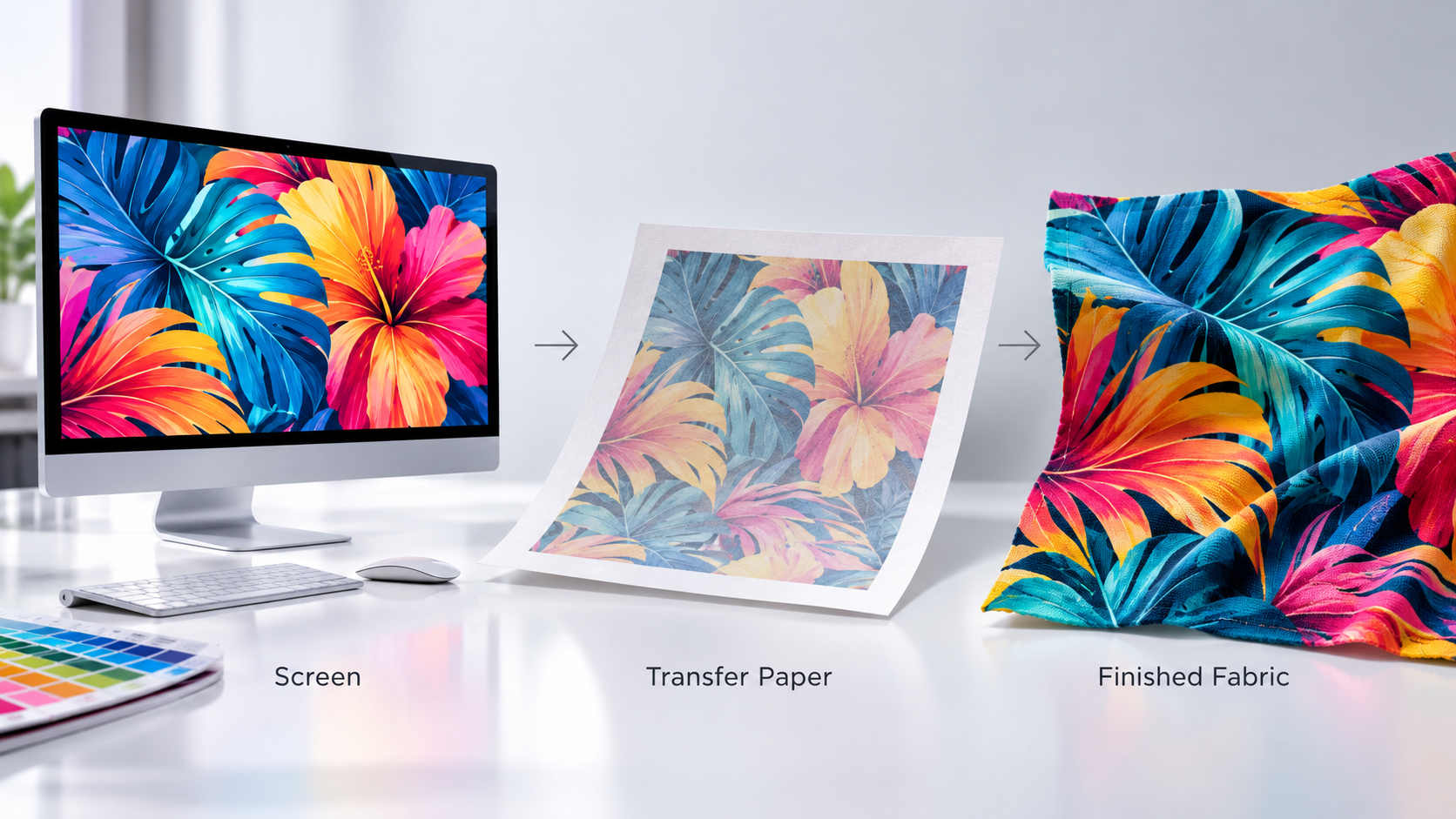
A design can look brilliant on screen, print onto the transfer paper looking dull and slightly off, then come off the heat press looking different again. To anyone new to textile printing, that is alarming. In dye-sublimation, it is simply how the process works. The color shown on a monitor, the appearance of the printed transfer paper, and the final color after sublimation are not expected to match at each stage, and managing the distance between them is the whole job.
This is why screen colors shift on textiles, and why dye-sublimation color management is a discipline rather than a setting you switch on. It is a core part of professional fabric printing prepress services.
This guide explains what actually happens to color between the screen and the fabric, why it shifts, and the prepress workflow that keeps the finished textile matching the intent.
Table of Contents
ToggleWhy Dye-Sublimation Color Works Differently
Most printing lays ink on top of a surface. Dye-sublimation does something else. Heat turns solid disperse dye into a gas, which bonds into the fibers of polyester fabric, or into a polymer coating, and becomes part of the material rather than a layer sitting on it. Whether the job is printed onto transfer paper and then pressed, or printed directly onto the fabric and fixed with heat afterward, the same thing is true: heat is what develops the color.
That single fact drives everything else. Before heat transfer, the printed appearance on the transfer paper is not a reliable preview of the final color. The full color develops only after the dye transfers and fixes into the polyester under heat. Because the finished color exists only after pressing, a monitor, tuned to show light, is an unreliable guide to how the dye will look once it has bonded into cloth.
Why the Printed Transfer Paper Looks Wrong
The first surprise in dye-sublimation is that the printed transfer paper looks muted, grayish, and undersaturated. Blacks look gray. Vivid colors look flat. This alarms people who expect the paper to preview the result, but it is completely normal: the dye has not sublimated yet. Only heat bonds it to the fabric and brings it to full saturation and depth.
Prepress rule: Do not approve dye-sublimation color from the transfer paper alone. The printed paper shows unactivated dye, not the finished result. Use a properly pressed sample on the actual production fabric as the color reference.
Why Does the Same File Shift From Screen to Textile?
Four things move the color between what is approved on screen and what lands on the fabric. Each one is manageable, but only if it is understood.
The screen is light; the fabric is dye: A monitor makes color by emitting light and can display brilliant values, including pure on-screen primaries and bright neons, that a sublimation dye set cannot always reach. Colors outside what the dye, ink, fabric, and process can reproduce get remapped to the nearest achievable color, and that remap reads as a visible hue or saturation change.
The fabric changes the color: Polyester content, weave, weight, surface finish, and the optical brighteners in the cloth all change how the dye appears. The same file on a matte poplin and a satin stretch is two different colors. A profile built for one fabric may not produce the same result on another, which is why the material is part of the color decision, not a detail settled afterward.
Heat, time, and pressure change the color: Temperature, dwell time, and pressure all affect the transfer. Settings that are too low or inconsistent leave it weak or uneven; excessive or incorrect settings can cause color change, dye migration, or loss of detail. The correct settings depend on the ink, paper, fabric, and equipment, and a press that reads one temperature but runs cooler under-develops every job on it, which is why consistency matters as much as the numbers.
Ink load changes the color: Put too much dye down, and it wicks and bleeds into the fibers, muddying detail and shifting color. Dye-sublimation needs deliberate ink limiting so the color stays clean and the fabric is not flooded with more dye than it can hold.
What Dye-Sublimation Reproduces Well, and What It Fights
Part of managing the shift is knowing where it is likely to happen. Dye-sublimation can reproduce a wide range of saturated colors, and often holds deep blues, greens, and rich photographic color vividly. Its achievable gamut is still limited by the printer, ink set, fabric, and transfer conditions, so very bright RGB colors, some brand colors, neons, and other highly saturated screen colors may sit outside it. Neutral grays and dark colors can also expose small profiling or process inconsistencies, because even a minor imbalance becomes visible in a neutral.
Knowing this ahead of output changes the prepress decision. Colors that sit outside what the dye can reach are identified and adjusted on purpose, pulled to the nearest clean color the process can actually hold, rather than left to clip on their own and surprise everyone on the fabric. A design built with the achievable gamut in mind shifts far less than one built to look its best on a screen.
The Fabric's Own Color Starts the Job
Dye-sublimation adds translucent color into a material; it does not lay down an opaque layer, so whatever the fabric already is shows through. The base white is the real starting point.
Two polyesters that both look white can carry different amounts of optical brightener and different undertones, and that difference rides through into every color printed on them. A warm-white base and a bright-white base will not return the same result from the same file.
This is one more reason the profile has to be tied to the actual production fabric. Moisture and environmental conditions affect color consistency too; where the fabric or process calls for conditioning or a pre-press step that follows the printer, fabric, and converter specifications.
How Prepress Keeps Dye-Sublimation Color Under Control
Managing all of that is the prepress job, and it follows a consistent workflow.
The center of it is color management built on the right profile. The file is handled in a color-managed workflow and converted through an ICC profile built for this exact combination of ink, paper or direct print, fabric, and press, not a generic process profile borrowed from paper printing. Getting that right is the same discipline behind any reliable prepress services, applied to a material that behaves unlike paper.
One of the most important profiling details is where the profile is measured. A dye-sublimation profile has to be built from pressed fabric, not from the transfer paper. The profiling chart is printed, sublimated onto the actual production fabric, and then the fabric is measured with a spectrophotometer. A profile measured off the paper describes a color that does not exist yet, which is why generic or paper-based profiles produce the casts and shifts that plague the process.
Prepress rule: Build and measure the color profile on the finished, pressed fabric, not on the transfer paper or a paper reference. A profile is tied to the ink, fabric, and press it was built on; if any major part of that changes, verify it and recalibrate or rebuild as needed.
Around that profile sit the supporting steps. The printer is linearized and ink limits are set first, so the profile sits on a stable base and the fabric is not overloaded. The design is soft-proofed through the fabric profile, so the shift can be previewed on screen before any material is committed. Brand-critical color is confirmed on a pressed swatch of the real fabric, because even a good soft proof is still a screen.
Press settings, temperature, time, and pressure are locked and logged and kept consistent, because color management assumes a stable press underneath it. And double color management is switched off, so the software and the output device are not both converting the same color and fighting each other.
For brand and spot colors, the reliable reference is a sublimation swatch book: the colors pressed onto the actual fabric and measured, rather than a coated-paper swatch that was never going to predict how dye behaves in cloth.
A Dye-Sublimation Color Checklist
This can be run before any textile job goes to output.
- Work in a color-managed workflow with an ICC profile built for this ink, fabric, and press combination.
- Profile built and measured on pressed fabric, not on transfer paper or a paper reference.
- Printer linearized and ink limits set before profiling, so the fabric is not flooded.
- Design soft-proofed through the fabric profile to preview the shift before committing material.
- Brand-critical color confirmed on a pressed swatch of the actual production fabric.
- Press temperature, time, and pressure locked, logged, and kept consistent across the run.
- Double color management is switched off, so only one stage converts color.
- Out-of-gamut colors identified and adjusted deliberately, not left to clip on their own.
- Brand and spot colors matched from a pressed sublimation swatch book, not a coated-paper guide.
Why the Shift Is Worth Managing
Textile output is rarely a single piece. It is a run of flags, soft signage, apparel panels, or decor that has to match across every length and, often, across repeat orders placed months apart. A color that is slightly off is not one bad print; it is a whole batch that does not match the approved sample or the last order.
Because the dye bonds into the fiber on the first press, a color problem is very difficult to correct afterward, so the color has to be right before the material runs.
Prepress rule: Do not rely on a second press to correct an incorrect color result. Reheating can cause additional dye migration, ghosting, or further color change. Color problems are corrected in the file, the profile, or the production settings before the next output.
Get Fabric Color Right Before Output
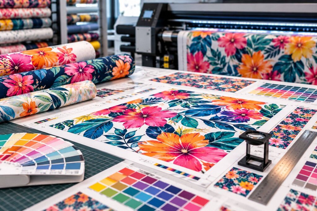
On textile, color is decided in prepress and fixed by heat, so the file has to be right before output. Alpha Prepress has supported print and textile production teams for 20+ years, with fabric artwork preparation, color-managed file setup, profile application, soft proofing, preflight, and press-ready file preparation.
The team works within your established printer, RIP, ICC profile, material, and production specifications, so files are prepared correctly before output, quietly under your own label, with same-day or overnight turnaround depending on scope.
Send your next textile file for review, or schedule a call to talk through your fabric color workflow.
